As part of a Motion Designer assessment for BigBasket, I was asked to redesign the payment processing experience.
Rather than treating payment verification as a simple loading state, I explored how motion could communicate system status, build trust, and reduce uncertainty. The final concept used a familiar card-reader metaphor to create a payment journey that felt intuitive, reassuring, and easy to understand.
Most payment experiences leave users staring at a loading spinner with little understanding of what's happening.
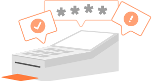
I wanted to make payment verification feel more tangible by borrowing a familiar real-world interaction: the card payment terminal.
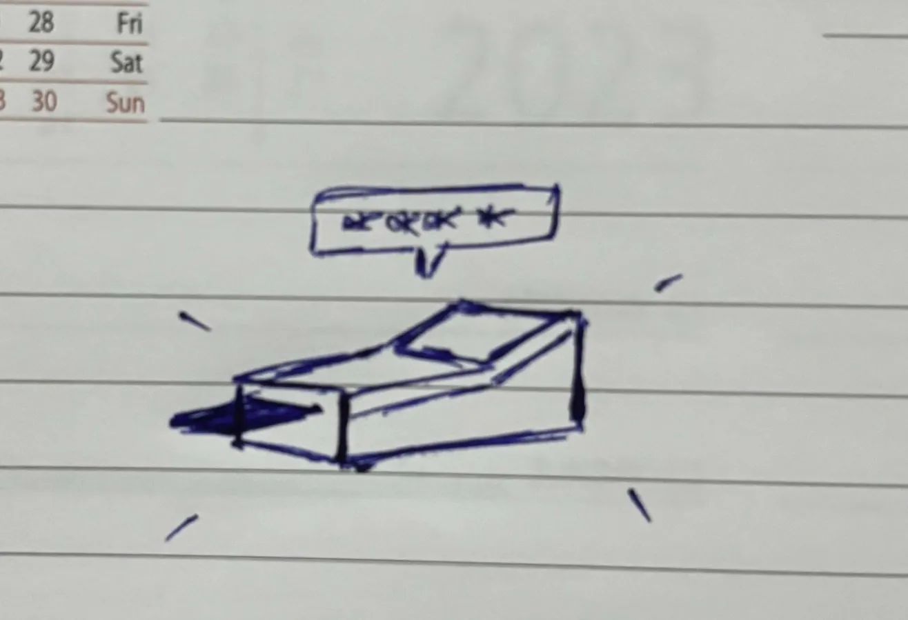

By turning the payment machine into the central visual metaphor, the experience follows a sequence users already understand: verification, confirmation, and completion.
The card reader illustration became the foundation of the experience. Instead of relying on abstract loaders, the illustration provided a familiar object users could instantly recognize and understand.

Every visual element was custom-designed specifically for the interaction, allowing the motion and interface to work together as a single system.
The flow was designed around three moments:
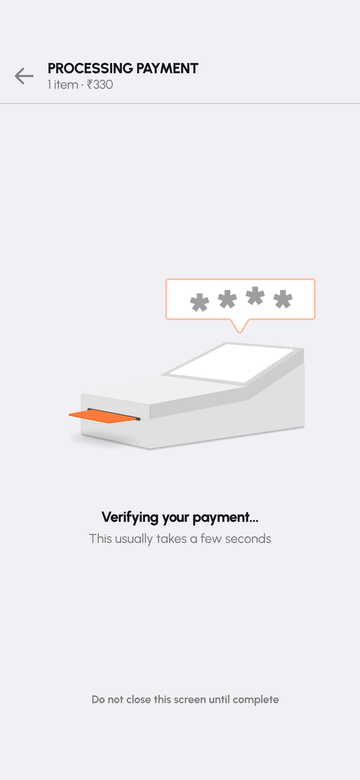
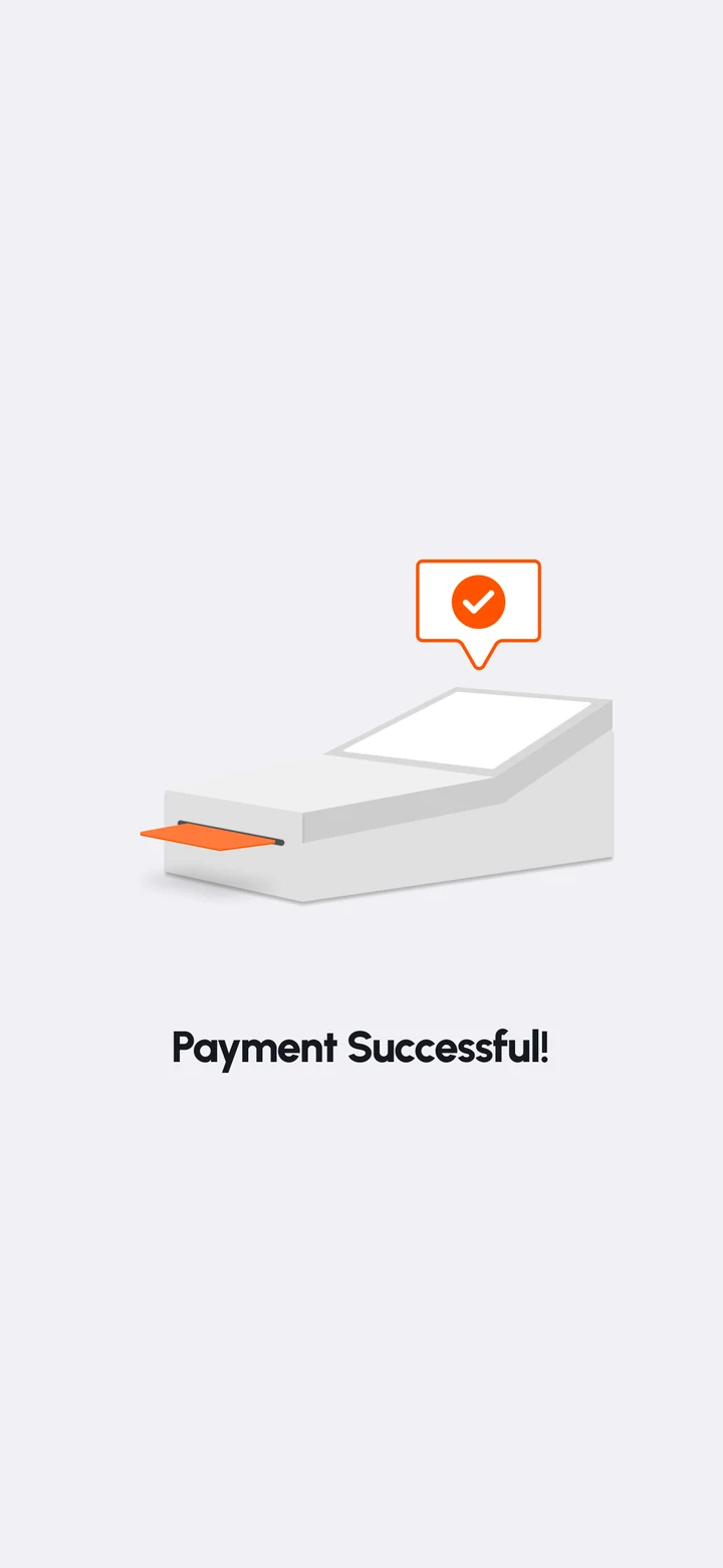
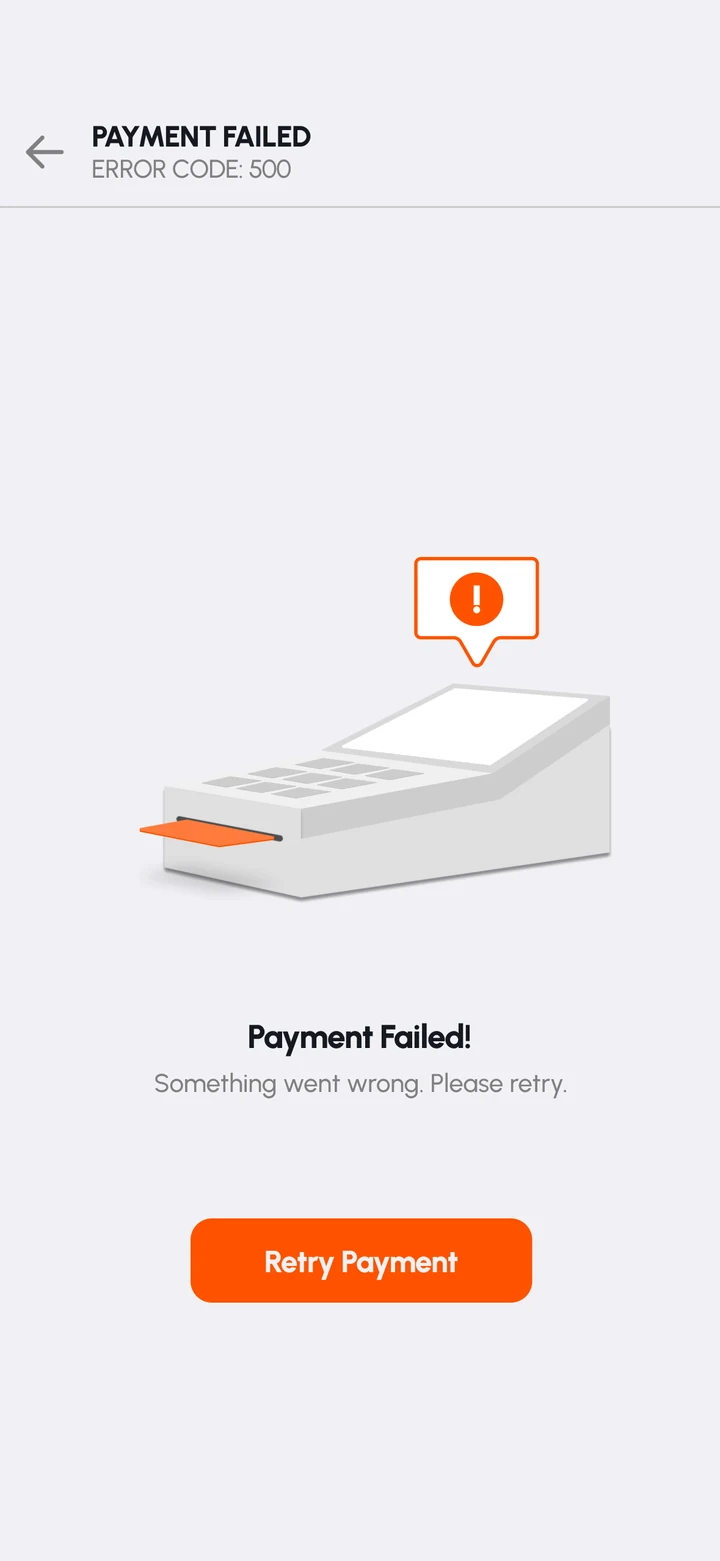
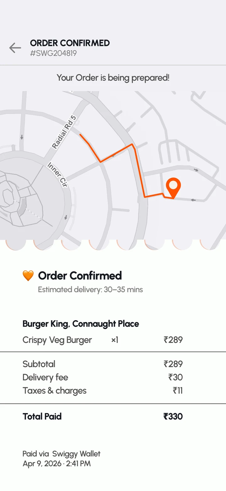
The final animation brings the entire experience together, transforming a passive waiting period into a guided interaction that communicates progress at every step.
This project reinforced a simple idea:
Motion isn't just about movement, it is a tool for communication. The most effective animations help users understand what is happening, reduce uncertainty, and build trust during important moments in a product experience.